Skip to content
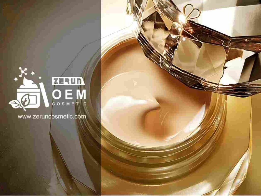
Premium skincare is often described as “expensive ingredients in expensive jars.” That story is comforting—and incomplete. Some of the most premium brands stay premium because they reduce failure: fewer texture surprises, fewer routine conflicts, fewer packaging complaints, fewer claim headaches. Price becomes the consequence of discipline, not the starting point.
Top premium skincare brands win by owning a clear archetype (clinic-led, couture ritual, barrier-first, science-actives, fragrance signature), then executing it consistently through product architecture (hero + support + ritual SKUs), refined textures that layer cleanly under SPF and makeup, premium packaging engineering (airless dosing, refill systems, heavy-wall materials), and compliance-safe claims supported by documentation. The most useful “top brand” lens is copying their decisions—not their names.
If the goal is to build a premium line, the real question becomes sharper: which premium pattern fits your buyers, your channels, and your manufacturing reality—and which luxury signals are quietly overpriced mistakes?
What is the “premium skincare brand” ?

Premium skincare brands are defined less by the number on the price tag and more by repeatable behavior: consistent sensorial performance, a routine that makes sense, packaging that feels intentional, and claims that sound strong without stepping into legal trouble. A premium brand earns trust by being predictable.
Premium is a bundle of signals, not one magic ingredient
- Routine compatibility: the product plays well with serums, actives, sunscreen, and makeup.
- Sensorial discipline: controlled absorption, intentional finish, low tack, low pilling risk.
- Packaging engineering: dosing, hygiene cues, travel tolerance, and shelf presence.
- Proof culture: careful claim language and documentation readiness.
A critical lens: premium can be real—or rented
A heavy jar can signal quality, but it can also distract from weak texture stability. A “rare” ingredient can sound impressive, but if it irritates or destabilizes the base, the product becomes premium in price only.
Top 10 premium skincare brands — Brand deconstruction framework

1) La Mer — Heritage indulgence
La Mer represents heritage indulgence: plush, cushiony textures and a ritual-first user experience that sells comfort as luxury. Its strongest asset is sensorial consistency—customers recognize the “feel” immediately—combined with gifting-friendly presentation that reinforces prestige even when claims remain conservative.
What they do differently:
They prioritize a signature “rich comfort” texture and a ritual cadence (how it spreads, settles, and finishes) more than aggressive claim language. Packaging and gifting cues amplify perceived value in prestige channels.
What not to copy blindly:
Don’t assume a richer texture always equals premium—over-occlusion can drive congestion complaints and reduce repurchase in humid or oily-skin markets.
OEM/ODM translation:
- Texture target: plush cream, slow melt, non-greasy cushion, low tack; strong after-feel elegance
- Packaging: heavy-wall jar or premium airless jar; strong closure tolerance
- Claim tone: comfort + barrier-support language; avoid “instant transformation” promises
2) Chanel — Couture heritage + refined experience
Chanel’s skincare plays couture heritage through refined textures, precise finishes, and immaculate packaging cues. It often wins on “in-hand” experience—weight, closures, and clean dispensing—paired with polished brand language that feels expensive without sounding clinical, supporting premium perception across retail and DTC.
What they do differently:
They treat packaging architecture and sensorial finish as core product design, not decoration. Their luxury signal is “controlled refinement” rather than bold claims.
What not to copy blindly:
Don’t over-invest in premium components if your channel can’t defend the price (or if logistics will scuff, leak, or damage the experience).
OEM/ODM translation:
- Texture target: elegant slip → fast settle; satin finish; makeup-friendly layering
- Packaging: premium pump or heavy-wall jar with high-tolerance closure; label aesthetics matter
- Claim tone: refined, benefit-forward, conservative wording with premium vocabulary
3) Dior — Couture science + ecosystem cohesion
Dior blends couture storytelling with visible packaging engineering and a cohesive brand ecosystem. The advantage is alignment: textures, scent choices, and pack design reinforce one another, helping customers understand routine roles and buy sets. Refill-forward systems in some lines also support prestige and sustainability cues.
What they do differently:
They sell “system thinking”—a coordinated routine with clear hero and support roles—so customers can justify spending across multiple SKUs. Packaging cohesion makes the line feel intentional.
What not to copy blindly:
Refill architecture can backfire if refill swapping is clumsy or if seal integrity causes leakage complaints—premium buyers punish these failures hard.
OEM/ODM translation:
- Texture target: signature finish consistency across SKUs (day vs night distinctions remain clear)
- Packaging: consider refill-ready formats only after stability + fit checks; premium shelf cohesion
- Claim tone: prestige-science phrasing, still within cosmetic boundaries
4) Sisley-Paris — French phyto-luxe
Sisley-Paris exemplifies French phyto-luxe: botanical inspiration with rich, slip-forward sensorials that feel substantial and classic. Its strength is experiential luxury—textures that feel nourishing and fragrances that read refined rather than trendy—supporting premium pricing through ritual pleasure rather than dramatic claims.
What they do differently:
They use sensorial richness and a botanical luxury narrative to create emotional value. The product feels “expensive” through glide, cushion, and a polished olfactory profile.
What not to copy blindly:
Botanical-heavy stories can trigger allergy or tolerance concerns; don’t scale fragrance complexity without a clear sensitive-skin strategy.
OEM/ODM translation:
- Texture target: rich glide, nourishing cushion; avoid greasy drag; refined after-feel
- Packaging: premium jar or pump; emphasize ritual cues
- Claim tone: sensorial + comfort + radiance language; avoid medical-sounding botanicals claims
5) Augustinus Bader — Biomedical hero minimalism
Augustinus Bader stands for biomedical hero minimalism: restrained aesthetics, a core technology narrative, and textures that feel elegant rather than flashy. The advantage is clarity—few SKUs, clear roles, and consistent finish—which reduces routine confusion and supports premium repurchase behavior with a “less but better” posture.
What they do differently:
They anchor brand value in a single, repeatable “platform” story and keep the line architecture simple. Minimalism becomes premium when texture performance is tightly controlled.
What not to copy blindly:
A platform narrative without noticeable sensorial payoff can feel like empty abstraction—minimalism must still feel premium immediately.
OEM/ODM translation:
- Texture target: elegant cream/cream-gel, fast settle, refined finish, low pilling
- Packaging: minimal premium (airless pump, clean label); fewer SKUs, clearer roles
- Claim tone: disciplined, support-oriented, avoids exaggerated transformation
6) SkinCeuticals — Science-led clinical prestige
SkinCeuticals represents science-led clinical prestige: an evidence-forward tone, active-focused routines, and professional adjacency. Its advantage is credibility—buyers accept premium pricing when the brand language feels disciplined and the routine logic is clear. It sells results-first positioning without relying on luxury theatrics.
What they do differently:
They lead with active logic and professional trust signals. Packaging is functional and clinic-coded, designed to support consistency and routine compliance.
What not to copy blindly:
Clinical tone alone won’t carry weak textures; if the finish is tacky or pills under SPF, reviews will erase the “science” halo.
OEM/ODM translation:
- Texture target: clean, fast-absorbing, non-tacky; layering-proof under SPF
- Packaging: airless pumps/droppers with clinic cues; dosage clarity
- Claim tone: precise appearance outcomes; avoid drug-like treatment language
7) Dr. Barbara Sturm — Anti-inflammatory minimalism
Dr. Barbara Sturm’s archetype is anti-inflammatory minimalism: quiet formulas, soft textures, and a tolerance-first brand voice. The advantage is buyer psychology—sensitive-skin customers often equate restraint with sophistication. Premium pricing feels justified because the promise is consistent comfort and low-drama performance.
What they do differently:
They treat tolerance as a premium feature and design sensorials to feel gentle yet refined. The brand sells “calm confidence,” not intensity.
What not to copy blindly:
“Gentle” can become “boring” if the texture lacks a premium cue; comfort needs a sensorial signature (finish, cushion, elegance).
OEM/ODM translation:
- Texture target: soft cushion, quick comfort, low sting risk; elegant, non-greasy finish
- Packaging: clean minimal premium; airless recommended for hygiene story
- Claim tone: soothing/support language; conservative, trust-building phrasing
8) Tatcha — Ritual-meets-modern luxury
Tatcha represents ritual-meets-modern luxury: story-rich sensorial identity, elegant textures, and a ceremonial daily-use feel. The advantage is emotional stickiness—customers buy the ritual as much as the performance. Product roles are usually easy to understand, supporting set-building and routine-based upsells.
What they do differently:
They make routine feel intentional through texture, scent, and “ritual” messaging that remains cosmetic-safe. The line encourages multi-step adoption without overwhelming complexity.
What not to copy blindly:
Ritual storytelling collapses if packaging is inconvenient or if textures don’t layer smoothly—premium ritual must be effortless, not fussy.
OEM/ODM translation:
- Texture target: signature sensorial cue (silky glide / cushion / refined dewy) with clean layering
- Packaging: visually cohesive set; jars/tubes that support ritual cadence
- Claim tone: experiential + appearance language; keep promises realistic
9) La Prairie — Ultra-premium Swiss clinical luxury
La Prairie sits in ultra-premium Swiss clinical luxury, where a high price ceiling is part of the brand signal. The advantage is world-building: weighty packaging, exclusive retail posture, and high-touch sensorials that feel unmistakably top-tier. It demonstrates how premium is engineered as an ecosystem, not a formula.
What they do differently:
They control the entire premium environment—presentation, channel, and tactile cues—so price feels “expected.” Packaging and exclusivity do heavy lifting.
What not to copy blindly:
Ultra-premium packaging costs can destroy margin if your channel is price-sensitive or your MOQ/logistics can’t protect the experience.
OEM/ODM translation:
- Texture target: high-touch sensorial (plush, refined finish) with stability discipline
- Packaging: heavy-wall + premium closure; consider outer box unboxing cues
- Claim tone: prestige language; avoid hard clinical claims unless proof supports it
10) Clé de Peau Beauté — Prestige radiance science
Clé de Peau Beauté embodies prestige radiance science with a makeup-adjacent finish philosophy. Its advantage is controlled glow: textures deliver smooth slip, elegant dry-down, and radiance that reads refined rather than oily. That alignment with complexion expectations supports premium conversion in prestige retail and beauty counters.
What they do differently:
They engineer radiance as a finish outcome—how skin looks under light—rather than only as an “active” story. Texture and dry-down are treated like complexion performance.
What not to copy blindly:
Optical glow can become greasy shine or flashback if mis-tuned; radiance must be controlled across skin types and climates.
OEM/ODM translation:
- Texture target: smooth slip, elegant dry-down, controlled radiance; makeup-friendly
- Packaging: prestige counter-ready; refined shapes and closure feel
- Claim tone: radiance/appearance language; avoid “permanent brightening” promises
Brand Archetypes Comparison table:
| Brand | Archetype | What they do differently (focus) | What not to copy blindly (risk) | OEM/ODM texture target | Packaging direction | Claim tone | Best-fit channels |
|---|---|---|---|---|---|---|---|
| La Mer | Heritage indulgence | Plush comfort + ritual sensorial consistency | Richness can cause congestion/grease in humid/oily markets | Cushion cream, slow melt, low tack | Heavy-wall jar / premium airless jar | Comfort + barrier-support | Prestige retail, gifting |
| Chanel | Couture refinement | In-hand precision + controlled satin finish | Premium parts may not survive logistics/price-sensitive channels | Elegant slip → fast settle, satin | Premium pump/jar, high-tolerance closure | Refined benefits, conservative | Prestige retail, DTC |
| Dior | Couture science ecosystem | Cohesive set logic + packaging engineering | Refill can backfire if swap/seal fails | Consistent finish across SKUs | Refill-ready after validation | Prestige-science, cosmetic-safe | Prestige retail, DTC |
| Sisley-Paris | Phyto-luxe | Botanical ritual + rich sensorials | Allergen/tolerance risks from botanicals/fragrance | Rich glide, nourishing cushion | Premium jar/pump | Sensory + radiance, realistic | Prestige retail |
| Augustinus Bader | Biomedical minimalism | Platform narrative + simple SKU roles | Minimalism without sensory payoff feels empty | Elegant cream/gel-cream, low pilling | Minimal premium airless | Disciplined, support-based | DTC, prestige |
| SkinCeuticals | Clinical prestige | Active logic + professional trust cues | Clinical tone won’t save tack/pilling | Clean fast-absorb, non-tacky | Airless/dropper clinic-coded | Precise appearance outcomes | Clinic, DTC |
| Dr. Barbara Sturm | Tolerance minimalism | Calm-confidence positioning | “Gentle” can feel boring without signature cue | Soft cushion, refined finish | Clean airless | Soothing/support language | DTC, prestige |
| Tatcha | Ritual-modern | Ceremony + easy routine adoption | Ritual fails if textures layer poorly | Signature sensorial cue + clean layering | Cohesive set packaging | Experiential + appearance | DTC, prestige |
| La Prairie | Ultra-premium ecosystem | World-building + exclusivity + tactile luxury | Packaging costs can crush margin | Plush high-touch, stable | Heavy-wall + premium closure + box | Prestige language, cautious | Prestige retail |
| Clé de Peau | Radiance science | Finish engineering (controlled glow) | Glow can turn greasy/flashback | Smooth slip, elegant dry-down | Counter-ready prestige pack | Radiance/appearance | Prestige retail |
What do premium brands do differently in product architecture?

Premium brands rarely rely on one “miracle” SKU. They build a routine system where each product has a job and the jobs don’t overlap. Routine clarity reduces hesitation, increases repeat purchase, and makes premium pricing feel logical.
The three-role model behind many premium lines
- Daily anchor: dependable comfort, low conflict with other steps.
- Targeted hero: a clear promise (firming, radiance, barrier support) with usage rules.
- Ritual/flagship: sensorial signature or packaging hero that raises brand ceiling.
Why “more SKUs” can dilute premium
When two products compete for the same role, customers stop understanding the routine. Confusion leads to lower repurchase and higher returns—especially at premium prices.
What a buyer brief should contain
A premium architecture brief becomes far easier when it uses routine roles, not just ingredients. The fastest way to structure that is a tight product brief—use the checklist style inside How to brief a cosmetic OEM skincare line and define each SKU’s role before debating actives.
Which texture cues make customers feel the price is justified?
Texture is often the hidden “conversion engine” of premium skincare. Buyers tolerate subtle claims if the texture behaves beautifully—especially under SPF and makeup. They punish premium products that pill, drag, feel sticky, or rebound into shine.
Texture cues that consistently read as premium
- Absorption curve: melts → settles → leaves an intentional finish.
- Finish control: dewy, satin, or matte—clearly chosen, not accidental.
- Low pilling risk: especially for AM routines.
- Elegant post-feel: comfort without greasy film.
Premium textures vary by market and channel
- Humid climates often reward weightless comfort more than rich occlusives.
- E-commerce buyers frequently prioritize “no tack, no pilling” because reviews amplify friction.
Common texture traps that look premium on paper
- Over-silky slip that masks weak hydration
- Heavy occlusion that feels luxurious but triggers congestion complaints
- “Instant glow” finishes that photograph well but wear poorly
Which packaging signals premium—and which choices quietly cause complaints?
Packaging is both a value signal and a complaint-control tool. Premium brands are more careful than they look: they know one leaking cap can cost more than the “savings” from a cheaper component.
Packaging choices that often earn their cost
- Airless pumps: dose precision, hygiene cues, reduced contamination anxiety.
- Heavy-wall jars: strong shelf impact, but requires clean-use guidance.
- Refill systems: best when the refill action is intuitive and the seal is reliable.
- Premium tubes: underrated for travel tolerance and oily-skin lines.
Quiet complaint drivers that premium brands try to eliminate
Pump clogging, leaky caps, messy threads, fragile inner lids, label scuffing, and “travel disasters” are the kind of details that end premium repurchase.
For OEM/ODM: connect packaging to channel early
If your distribution is DTC and Amazon-heavy, packaging decisions should prioritize leak control, dosing clarity, and review-proof usability. For prestige retail, shelf impact and tactile luxury can carry more weight. A practical way to anchor this discussion is routing packaging choices through your Private label skincare solutions page structure so buyers see options matched to channels.
Why do some expensive skincare products disappoint buyers?
Premium price increases expectation. When expectation rises faster than real-world experience, disappointment becomes louder—and reviews become harsher. Expensive skincare often “fails” not because it’s unusable, but because it violates the promise implied by its price.
Four common disappointment patterns
- Story-first, texture-second: impressive actives, but tacky feel or poor layering ruins daily use.
- Fragrance fatigue: a “luxury scent” that becomes overwhelming over time or irritates sensitive users.
- Packaging drama: clogged pumps, leaks, messy dispensing, or complicated refills.
- Claim inflation: language that implies transformation, delivering only mild comfort.
A more balanced interpretation
Some premium products are priced for brand equity and distribution reality, not just formulation cost. That doesn’t make them “bad,” but it changes what buyers should expect: prestige can be an experience premium, not always a performance leap.
How does channel strategy change what “premium” means?
Premium signals shift by channel. The same formula can feel premium in one place and risky in another because the buyer’s evaluation method changes.
Department store / prestige retail
- Premium is signaled by presentation, storytelling, in-hand feel, and merchandising.
- Refill systems can enhance perceived sophistication when well-executed.
DTC
- Premium is validated by education, routines, and repeatable experience.
- Texture and tolerance matter because buyers commit without in-store sampling.
Amazon / marketplaces
- Premium must survive reviews and logistics.
- Packaging durability, leak resistance, and clear usage instructions become essential.
Clinic / spa
- Premium is credibility and tolerance, plus a professional-feeling routine role.
- Conservative claim tone often converts better than dramatic promises.
How do premium brands stay compliant while still sounding powerful?
Premium brands often use precision rather than volume: comfort language, appearance outcomes, and “supports” framing. Strong words can exist inside cosmetic boundaries, but they must match the proof plan.
Red-flag vs safer wording (practical swap table)
| Risky wording (red-flag) | Safer cosmetic wording |
|---|---|
| “Treats eczema / dermatitis” | “Helps soothe the look of dryness and discomfort” |
| “Heals damaged skin” | “Helps support the skin barrier” |
| “Eliminates inflammation” | “Helps reduce the look of redness” |
| “Repairs DNA / reverses aging” | “Improves the look of firmness and smoothness” |
| “Cures acne” | “Helps improve the look of blemish-prone skin” |
Proof ladder that premium teams plan early
- Ingredient documentation → stability → compatibility (formula + packaging) → targeted consumer/perception tests when needed. Premium credibility is often less about one heroic study and more about a culture of controlled delivery.
How To build a premium skincare line via OEM/ODM without copying brands blindly?
The safest approach is choosing one archetype, building clear routine roles, locking texture targets early, deciding packaging architecture before cost debates, and writing claims that match the proof pathway. The premium projects that launch cleanly are usually the ones with fewer revisions, not the ones with the most ingredients.
Brand archetype-to-build matrix (copy decisions, not identities)
| Archetype | Best hero role | Texture cue | Packaging cue | Claim tone | Best-fit channels |
|---|---|---|---|---|---|
| Clinic-led | Post-procedure comfort | Quiet, low-sting | Airless | Conservative, credibility-led | Clinic, DTC |
| Couture ritual | Signature cream | Plush, sensorial | Heavy-wall / refill | Elegant, emotional | Prestige retail |
| Barrier-first | Daily anchor | Cushion, non-greasy | Airless | Support/comfort | DTC, clinic |
| Science-actives | Targeted hero | Clean, fast-set | Airless / dropper-based systems | Specific, results-forward | DTC, clinic |
| Fragrance signature | Ritual flagship | Luxurious glide | Premium jar | Lifestyle-led | Prestige retail |
Where 2–3 internal links naturally support conversion
- Cluster navigation and topical depth: Most expensive skincare
- From strategy to execution: How to brief a cosmetic OEM skincare line
- From research to commercial plan: Private label skincare solutions
Three premium paths brands can choose
If the goal is clinic-led premium
Build a quiet daily anchor first: low drama texture, high tolerance, airless packaging, conservative claims that feel professional.
If the goal is refill-led prestige
Design the refill system as the hero: smooth swap experience, reliable seal, and an outer case that feels durable enough to “keep.”
If the goal is fragrance-led luxury
Treat scent as product architecture, not decoration: IFRA-smart fragrance, controlled longevity, and a texture that doesn’t compete with the scent profile.
Share your target region, primary channel, preferred finish (dewy/satin/matte), and packaging direction (airless/jar/refill). The premium archetype can then be translated into a clear SKU map, texture targets, packaging options, and a claim vocabulary that sells strongly without creating avoidable risk.